Thank you for visiting my little part of the world!
-

Wild Flour Bakery logo + branding
The cutest local bakery in town. The branding matches the bread + vibe in the building. It was so fun to work with Wild Flour.
-

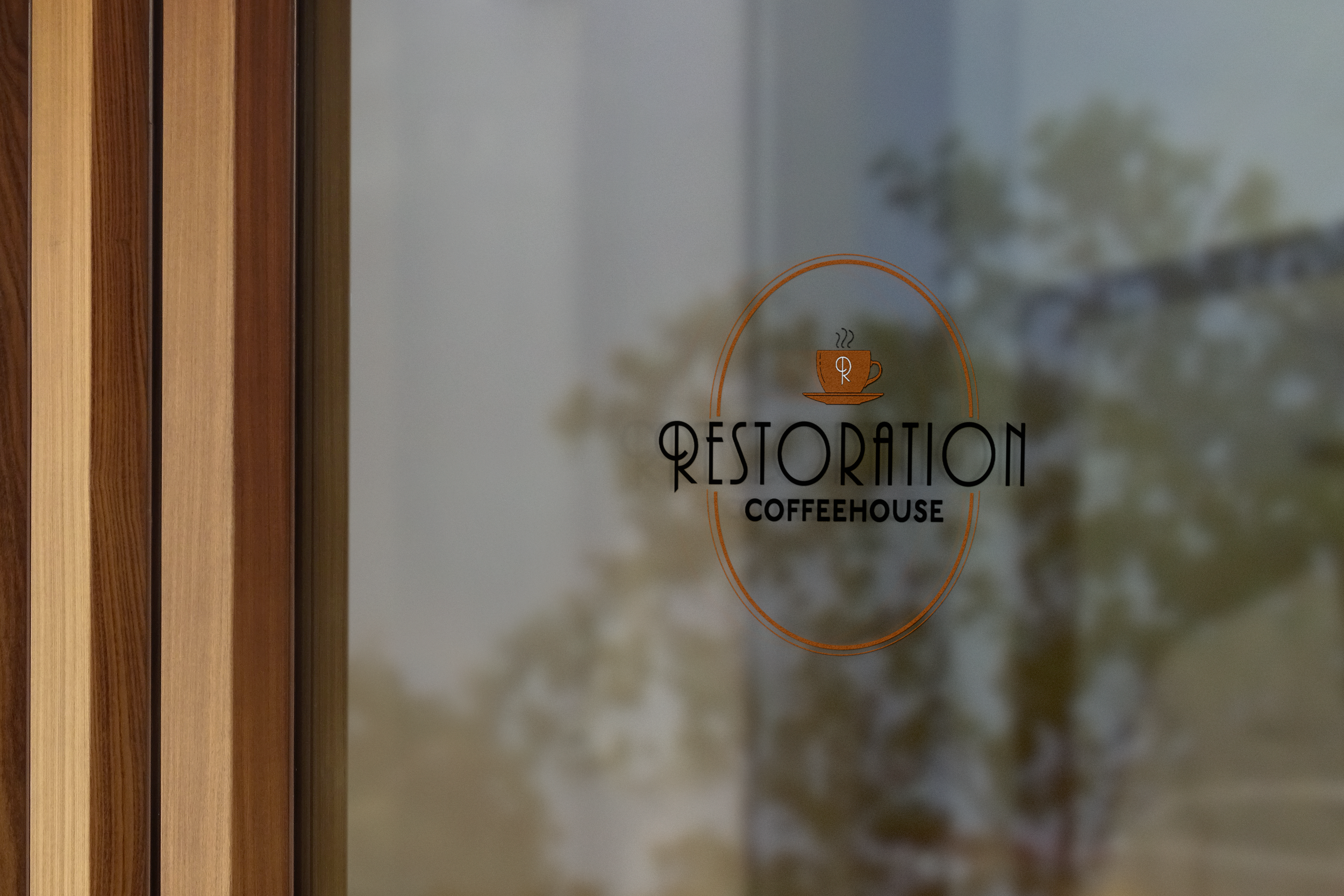
Restoration Coffeehouse Logo
This logo was designed for a local coffeeshop that is moving into an old bank downtown. The building has an Art Deco vibe which is where the inspiration for the logo came from. It fits very well and looks great hanging from the building.
-

Hope Journal
This journal was designed as a personal project to encourage people to see hope speak hope in their lives and others. The goal was to be a minimal design while also fun.
-

Pasta Amore Paper Goods
These paper good resources were designed for a family Italian Restaurant. It was important that these goods displayed the food and culture well while being readbale for all people.
-

Epoch MVMT Branding
Epoch MVMT was designed to be a unique gym / training program. The goal was to stand out and not look like a normal gym. The branding is designed around the meaning of the name Epoch.
-

Providence Ministries logo + branding
A ministry designed to help people walk in God’s providence. This project was feminine and fun to do. Check her out on social media.
-

Magazine Cover Layouts
These covers were designed to showcase typography and professional photos. They showcase that with great visuals and layout, you can create a cohesive look.
-

Science Magazine Layout
This magazine spread was designed for a Science magazine for people who like reading about space and science. It displays and showcases well how to take large pieces of information and lay it out.
-

Upper Crust Bakery Branding
Upper Crust Bakery was designed for a local bakery with a French background. The typography and colors resemble a French background in a modern way that is easily scalable for all projects.
-

Fun logo for our family
This project showcases my work with typography + colors and how they work together to enhance a design. Typography can make or break a design.
-

Jessa Ankers Photography Mockup
Jessa Ankers Photography website was designed to be a high-end, classy experience. The goal is to attract brides that want to have fun on their wedding days but also have a classy experience. The typography and colors play a large role in succeeding that goal.
-

Amethyst Bay Resort and Spa Magazine
This magazine cover was designed for a Resort to attract couples who are in need of a relaxing getaway during the pandemic.

